Reviving my blog
I have been away from this blog for a long time. I’m still not feeling the same drive to write that I used to have before, but I want to give it another try.
I have switched jobs. I live now in a new country. My role have changed and my views have adapted. I have things that are worth writing. The hard part is putting myself to do it.
This is an account of the process I have followed to revive the blog’s looks and the build tools.
The looks
I’m not a designer, neither by trade or calling. I consider myself a man with simple tastes, and a preferrence towards simplicity and space.
Therefore I wanted a simple, minimal blog, featuring some degree of elagance. From the start I knew I don’t have them in me the tools, so I asked GPTs for it.
I asked for a “modern” look with dark and light theme, and it gave me some horrible plain and lame all-white site. I insisted by providing specific instructions. The sizes of the screen, the spacing, etc. After some iterations I had a decent starting point.
I took inspiration from other good-looking blogs. I cannot remember now the list of all, so I cannot give them proper credit.
The fonts
I have been undecided between Roboto and Merriweather for the body of text. I wanted an accesible font, and I have read that sans-serif fonts tend to be nicer in terms of accessibility.
Nevertheless (I think) I have decided for Merriweather. I like it and there are some positive reports about it being fairly accessible, even for people with dyslexia.
For font in the logo I initially used Cinzel only to discover that it has no glyphs for the braces or the universal quantifier. I decided to switch to Libertinus Math which keeps a bit of the elegance of Cinzel (albeit diminished) and have glyphs for all the symbols I use.
For the font size, I went big.
I find myself very often reading with a 120% zoom. I’m slightly shortsighted and have some degreed of astigmatism. Text with small fonts are fused together and the strokes become very blurry.
Just compare
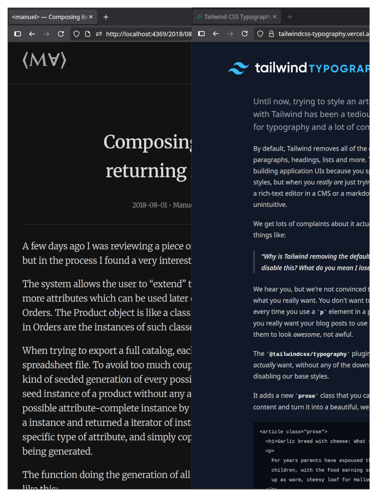
Yes, the screenshots have been rescaled to fit in this blog. In my eyes, however, I can still read my blog without too much effort.
I wanted to be able to read my blog without zooming in. I hope you don’t need to zoom out.
The colors
This was another struggle. Chosing colors that combine well together is very hard for me (and GPTs). I kept it simple — black, white and grays in between for the main text and styling; and Pygment’s Lovelace and Material for the code blocks.
This is not settled
I’m still tweaking the sizes, and weights. I need to work more for the smaller screens. The titles are too big there, and there is too much wasted space.
The tech
I used to write this using Tinkerer, which is no longer maintained, and I could not make it work with the latest Python.
I have switched hence to Pelican, and I keep my blog’s virtual env with uv.
I keep writing in reStructuredText [1]. I will probably write about reStructuredText v. Markdown in some later post. You know already my stand.
I experimented with using TailwindCSS in my base.html template. TailwindCSS allows to iterate quickly about the styling of the main templates. Nevertheless, I still need CSS for the generated HTML from reStructuredText. So this is still an ongoing experiment.
I’m also using HTMX to boost the links, and the Material Icon SVG for the icons of the color scheme selector.
Footnotes
| [1] | I have no clue why Markdown won the text-format battle. There are so many Markdown flavors and extensions that you always need to be reminded which kind of Markdown you are using. Let’s keep this rant for another day. |